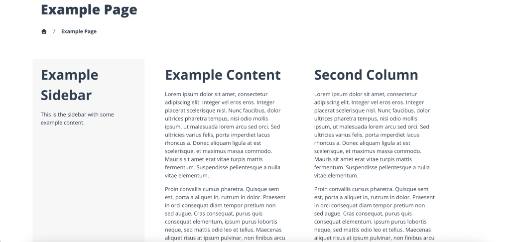
The 2 column sidebar template will have a sidebar on the left hand side of the page while you have two columns of content to be able to add. Each content column is 50% of the remaining space. On mobile, the content and sidebar will stack with the sidebar on top of the content going in order.
On a mobile, the container width is 100% of the screen and on desktop this has a maximum width of 1320px, with the sidebar taking 25% of this space and the two content columns taking 33.33% of this space.
The block editor is available for the Page Builder, Second Column Blocks and also the Sidebar builder. For more information on the available blocks, see the Blocks category.
If needed the sidebar can be disabled and this page will display the two columns side by side (50/50), or stacked on mobile without the sidebar.